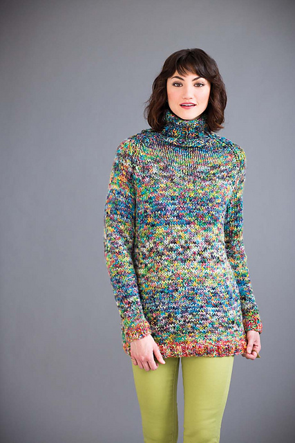
Last October I took a class from Andrea Mowry, of the popular “Fade” patterns on Ravelry, called “Color Confidence”. The class was paid for by a scholarship from my Guild, one of the great benefits of being a member. Her color change patterns are similar to an ombre, but instead of going from light to dark, they go from one color to another. My hope was to learn through her color combination techniques, ways to use various 4oz braids that we all seem to purchase without necessarily having any plan for. Her patterns primarily use the speckled, hand-painted yarns that are so popular right now, but there is a lot of handspun that also ends up being colorfully variegated, so my thought was that handspun would be a reasonable substitution.
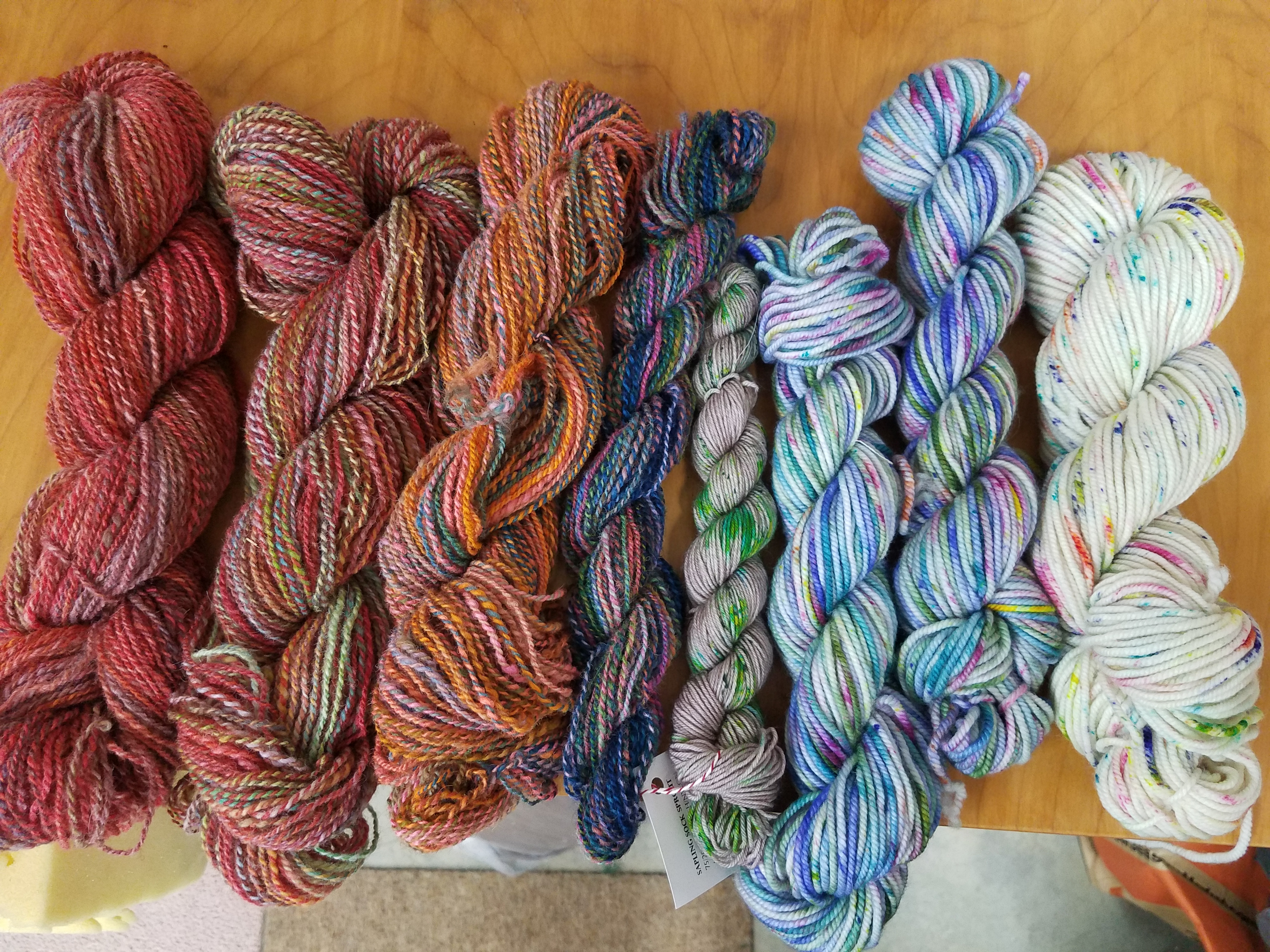
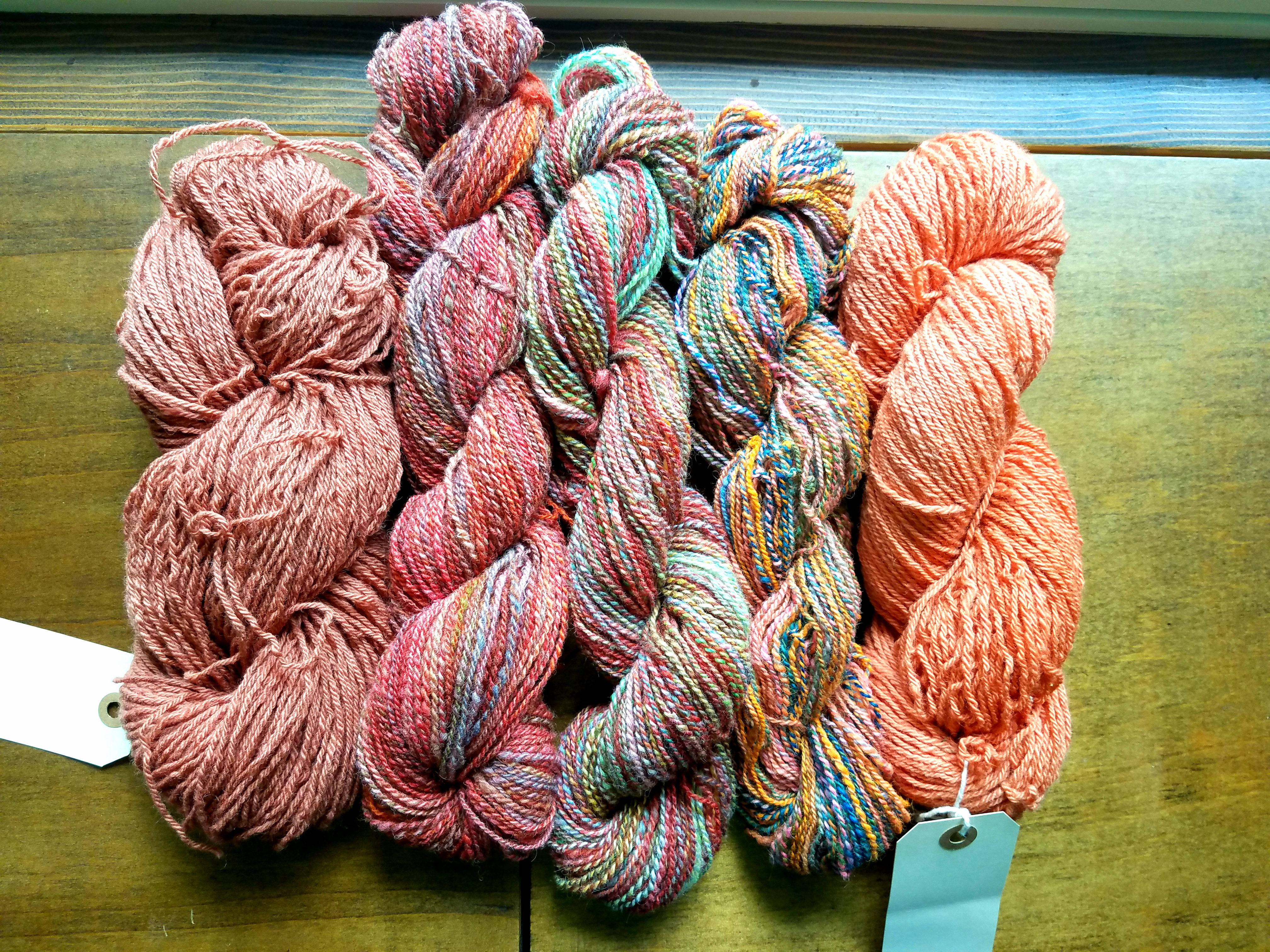
Speckled commercial yarns; hand-dyed handspun yanrs
The first part of the class was learning how to do two-color brioche knitting, which is one of her favorite techniques. Although it involves brioche-specific stitch names, once you get the hang of it it’s fairly easy to see how it works, especially if you are using dissimilar colors. It also helped that Andrea was a good, patient teacher! If you think you might be interested in learning the brioche stitch, I would recommend actually taking a class. You will end up with a lightweight, two-sided fabric, with the background color having the effect of “muting” the foreground color.
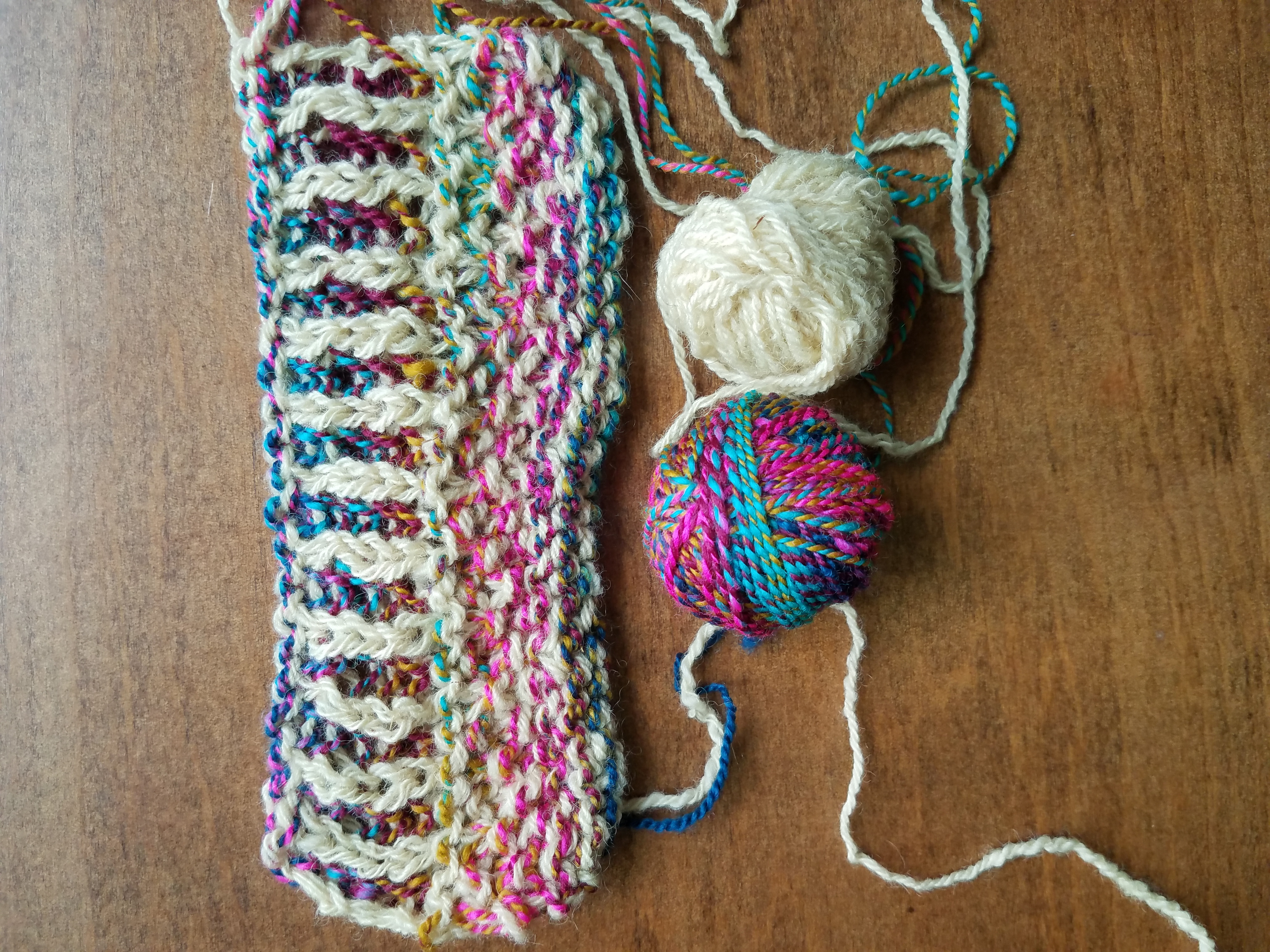
Brioche stitch side A
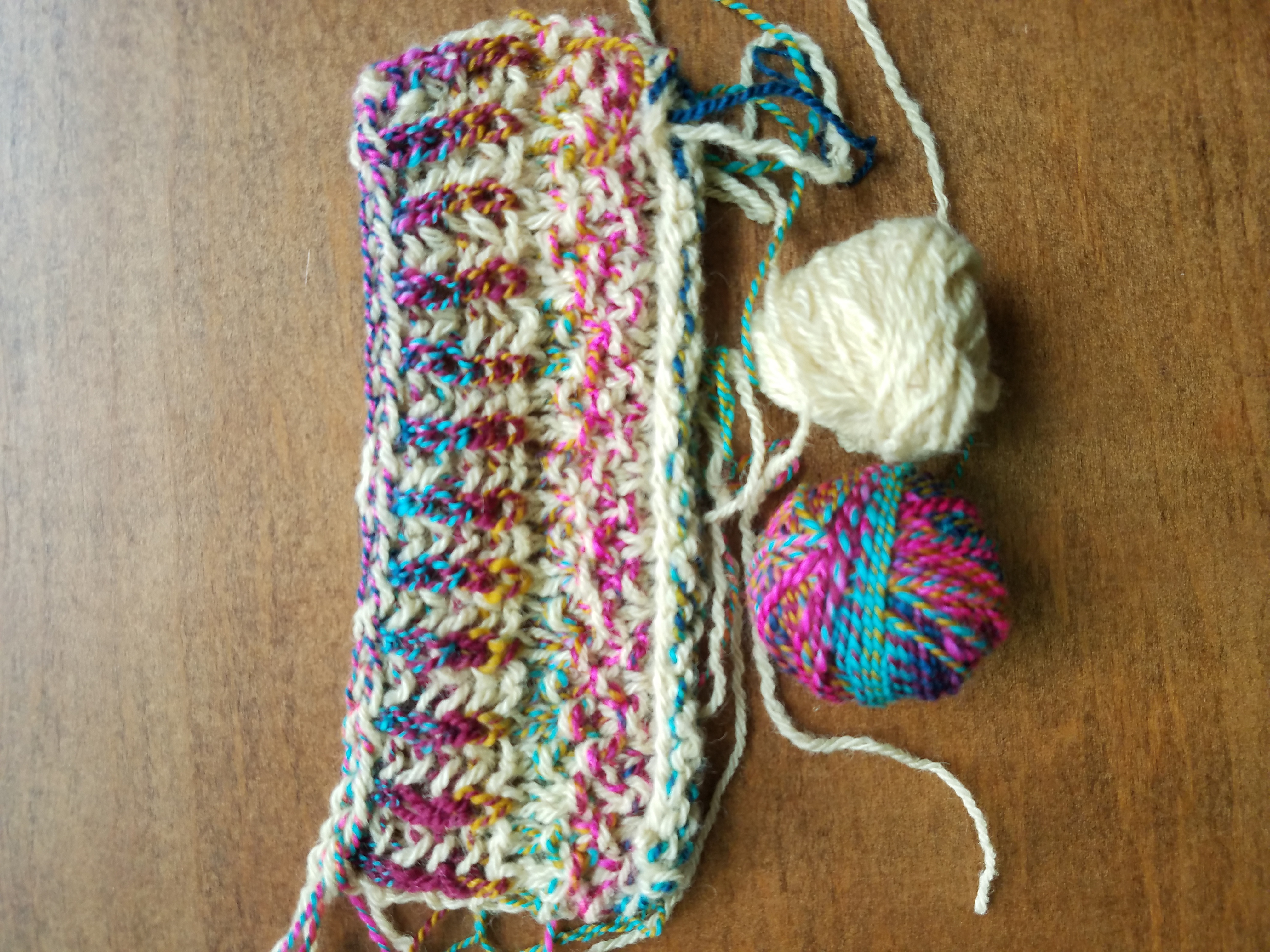
Brioche stitch side B
The rest of the class focused on Andrea’s techniques for combining color, or in her words, “painting with yarn”. The first technique she discussed was the marled effect you can get by simply holding two strands of different yarn together and knitting. This look seems to go in and out of fashion, but it’s been very popular in Vogue Knitting for the past several years, and it is an interesting way to do optical blending. This is also easy to replicate with a two-ply barber pole handspun.
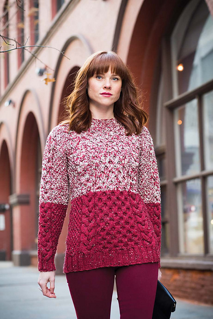
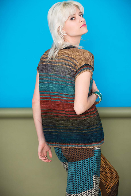
Vogue Knitting Late Winter 2017
Vogue Knitting Late Winter 2017
She then discussed color pooling, and how she breaks up the occasional patches of color that can show up in odd places in your knitting. She is a big fan of using textured stitches, like garter stitch and lace patterns, to visually visually break up the pooling. We knit some samples of two yarns held together in garter stitch, and I chose a solid red and a red-with-lots-of-other-bits-of-color handspun, and I was surprised how much the garter stitch toned down all the other colors. Visually the swatch looked mostly red. After thinking about it, I shouldn’t have been so surprised: a yarn that’s 100% red combined with a yarn that’s 50% red will end up looking 75% red. Combining that with garter stitch, where you are basically seeing only every other row, and of course it will tone down the variegation dramatically.
We then talked about color value, or where a particular color falls on a greyscale. For colorwork such as Fair Isle or mosaic knitting, Andrea recommended having high contrast in value, otherwise the finished motif will look “muddy”. For her Fade technique she recommends using a low contrast in value. When considering whether the colors you like actually work together as far as value, she showed us that by taking a black-and-white picture of your fiber on your cell phone, you can easily see if you’ve got a high or low contrast, because the photo will take away the hue and leave only the value. When Andrea picks yarns for her Fade patterns, she is looking for a greyscale gradient.
Natural-dyed and ice-dyed yarns
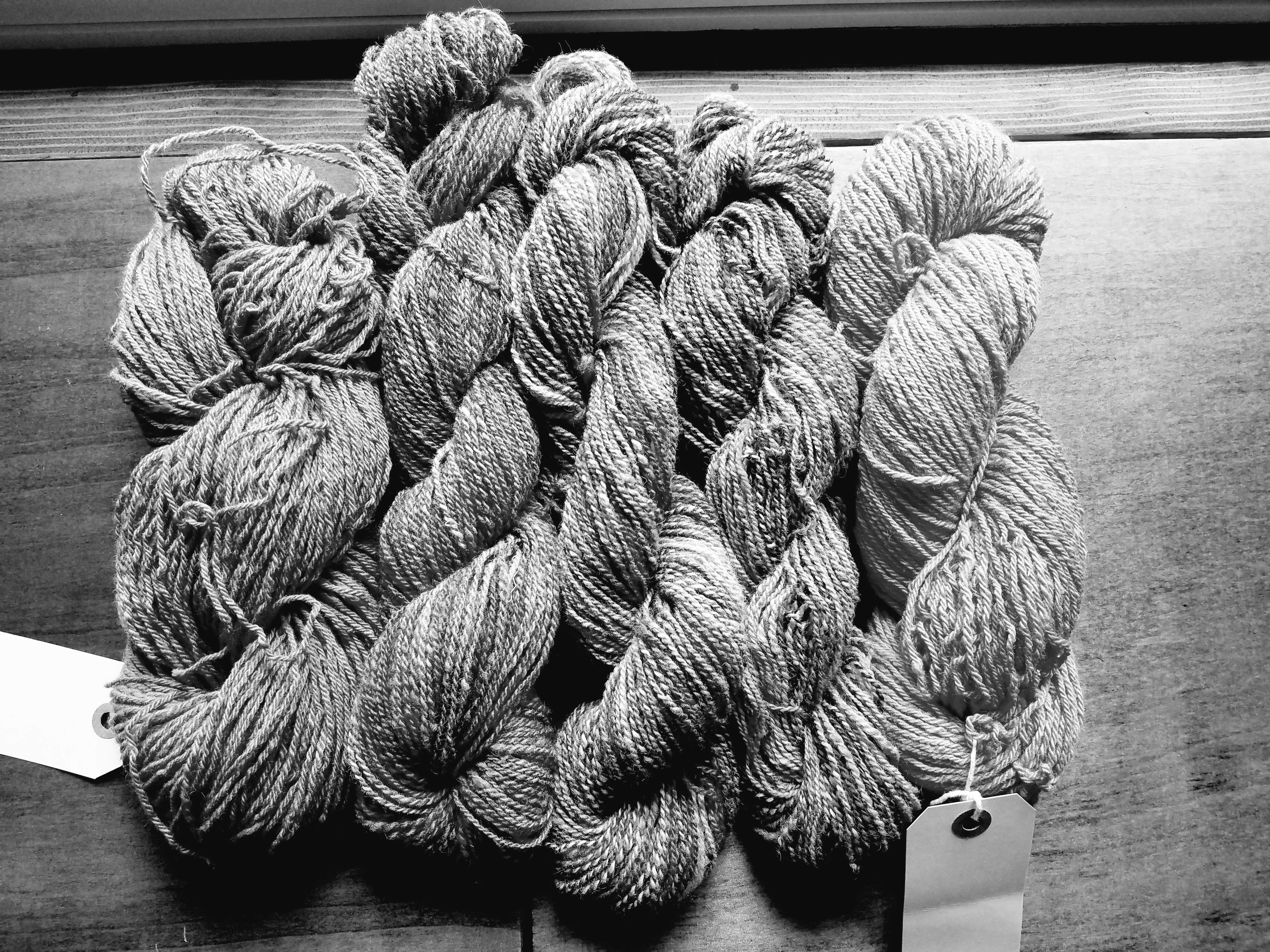
The same yarns in greyscale
Finally, she discussed how she transitions from one color to the next. She recommends using yarn from the same dyer when you first start trying her patterns, because you will be able to find families of color combinations to help your Fade blend smoothly. If you are the dyer, so much the better! One of her techniques is to use the Fibonacci sequence to gradually decrease one color and increase the next color, rather than just dropping one color and starting the next.
An example of the Fibonacci sequence, Vogue Knitting Early Fall 2017
Reverse stockinette stitch will hide lines between color changes more easily than regular stockinette. Adding mohair or another fiber with halo will help blur or “fuzz out” color changes. And finally, you can always Fade into a neutral!
For me, the biggest tip was her advice, when choosing colors, to pick something that will look good with your skin tone at the part that’s going to be up by your face. That way your finished project will look good on you, and you will still have the freedom to experiment with colors that you wouldn’t normally think you can wear.
Taking this class really made me consider the role that stitch texture and the physical structure of the yarn being used plays in the perception of color, which I will definitely keep in mind for future projects. Added to that, Andrea was charming and generous with her knowledge: if you are a class-taking sort of person, I would certainly recommend her.
These are all pro-tips. Love it. Picking colours for a project can be so hard, maybe that’s why some people (not me of course!!!!) pick the same colours over and again. Lack of colour confidence.
I love the fibonacci fade and using mohair is a hot tip. I’ve done that and it really works well.
Also agree about brioche knitting. Not as hard as it looks and a great skill for knitters to acquire.